Context
The insurance company is an app that allows users to manage their policies for electronic devices quickly and independently.
The initial version relied on long, technical instructions adapted from internal manuals, making it difficult for users to understand and complete key actions such as reporting a claim, switching devices, or adding a new product.
The challenge was to translate highly technical content into a smooth, intuitive, and emotionally supportive user experience while maintaining the legal and operational precision required in the insurance industry.
Project Goals
Simplify and humanize the language so that any user can understand it without prior technical knowledge.
Optimize action flows for each functionality, removing friction and confusion.
Design microcopy and contextual messages that guide users step-by-step without the need to consult a manual.
Preserve legal and contractual accuracy, integrating required terms in a natural way.
Role & Contributions
As a UX Copywriter & Content Designer, my contributions included:
Content audit of the original manual to identify redundancies, jargon, and unclear steps.
Plain language rewriting of key functionalities:
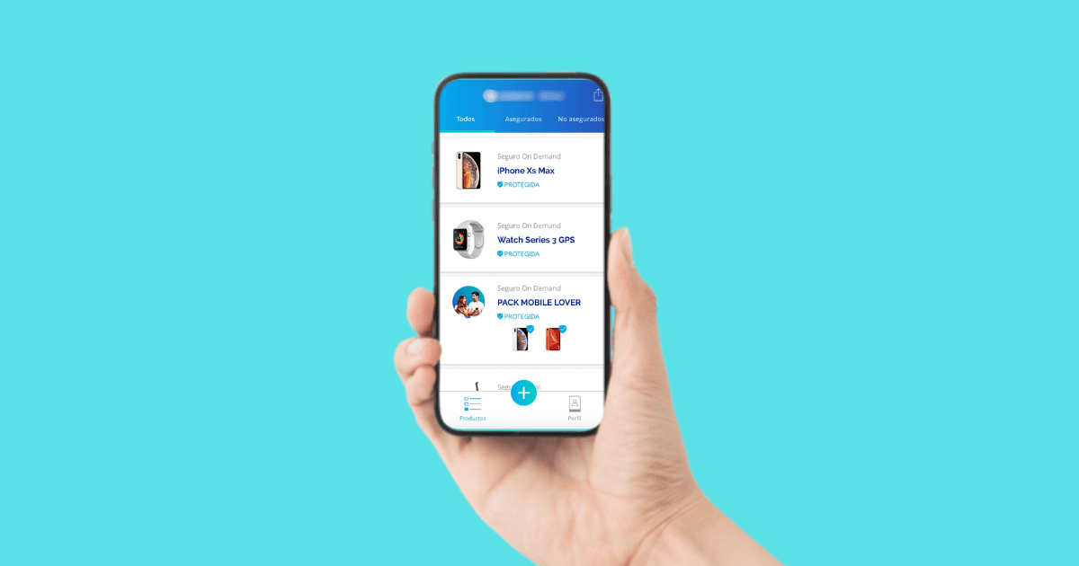
Dashboard and insured devices overview
Coverage details
Document and invoice management
Payment methods and receipts
Claim notification process (chatbot)
Product change and policy cancellation
New device insurance process
Creation of empathetic and persuasive microcopy for high-stress moments (e.g., filing a claim) and confirmation steps (e.g., successful contract completion).
Clear, action-oriented calls to action (“Learn more,” “Upload invoice now,” “Confirm device change”) that improved both hierarchy and tone of voice.
Tone and style definition: friendly, secure, and trustworthy—aligned with Zurich’s brand but free from overly technical coldness.
Content Strategy
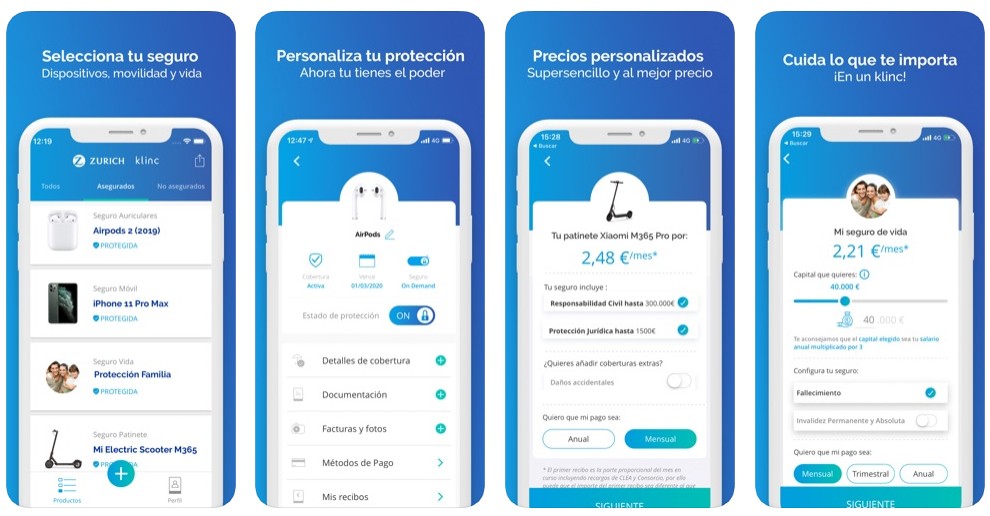
To guide users through complex processes such as policy activation or product replacement, I applied:
Progressive disclosure: only showing the necessary information at each step, with the option to expand details.
Action-focused language: direct, second-person instructions (“Upload your invoice,” “Select your payment method”).
Positive reinforcement: messages that celebrate progress and reassure users (“Done! Your new device is now protected”).
Anticipating doubts: inline tips and clarifications without overwhelming the interface.
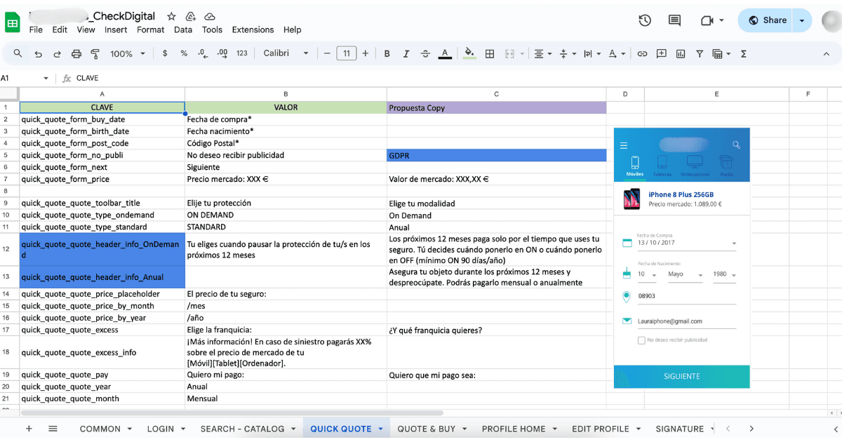
Copy Transformation Example
Before (technical manual):
The user completes the verifications requested by the App, enters the serial number, and attaches the photo of the object.
After (UX-optimized copy):
Verify your device: enter the serial number and upload a clear photo so we can ensure it’s protected from day one.
Impact
Expected reduction in customer support queries thanks to clearer, contextual instructions.
Increased user autonomy in completing complex processes within the app.
A smoother, brand-aligned experience that delivers on the company promise: 100% digital insurance fast and hassle-free.